There has been a good deal of discussion regarding the correlation between temperatures at various locations throughout Antarctica. Several people have looked at the relationships between correlation and distance by creating graphs linking the two. One of the difficulties in interpreting these is that they are affected by a variety of factors, including the shape and topography of the continent and by the fact that the place is completely surrounded by a large pool of water.
It is informative to pick several locations and to see how the AVHHR series at that location is related to all other locations. I selected two points: the tip of the peninsula (Steig series 1) and the obvious interior point: the South Pole (grid point 1970 is the closest).
For a selected site, after calculating the 5509 correlations, we graph them using a color scale to represent the correlation (as usual red is positive and blue is negative and white areas represent zero correlation). The location of the grid site is represented by a green +. Keep in mind that these are correlations measuring relationships between temperatures at the grid point, not positive or negative trends.
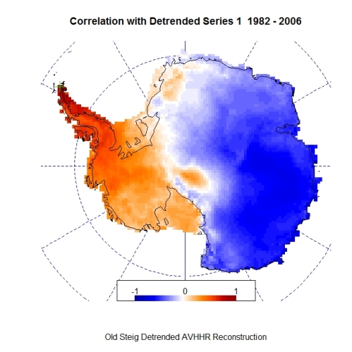
First, we take the latest revelation from Steig, the cloud masked AVHHR data. The grid point is on the tip of the peninsula.
Several things stand out in the graph. Obviously, the region immediately adjacent to the grid point is strongly correlated, but what is somewhat surprising is that the correlation drops off fairly becoming negative while still in the Western Antarctic area. The relatively low correlation continues to the rest of the continent.
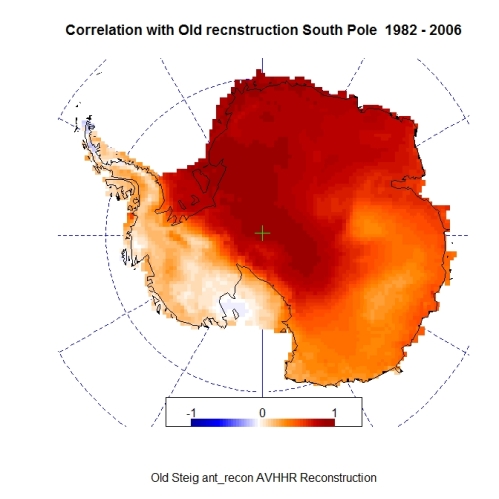
Next, we take the original reconstruction: ant_recon.txt. This was supposedly reconstructed from the previous data using RegEM and the manned surface stations:
The correlation has strengthened dramatically in the Western Antarctic so that now the pattern exhibited by the reconstruction at the tip of the peninsula seems to be reflected by the entire west. As wll, the Eastern portion has now become more strongly inversely correlated with the peninsula.
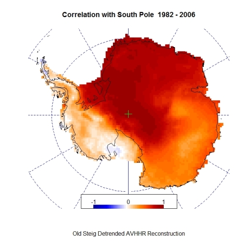
There were two other reconstructions done by Steig to demonstrate “robustness” of their procedure. One was to “detrend” the original reconstruction in the period from 1982 to 2006 presumably before redoing the RegEM. Using the data from that reconstruction we get:
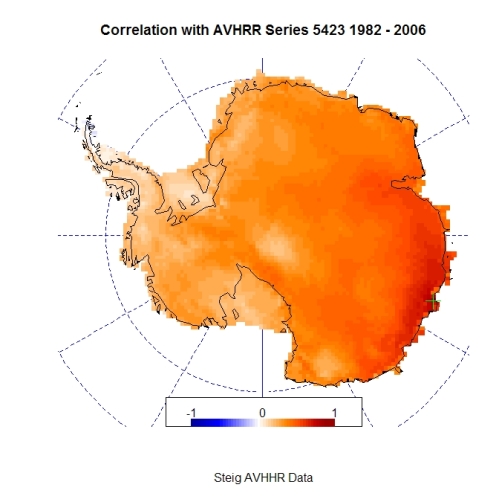
As well, they apparently did a 3 PC reconstruction which I believe did not use RegEM. I tried to relate it to the PCs you get from the cloudmasked data set, but sofar I have been unsuccessful. Another puzzle to solve! Anyway:
The last three graphs are pretty much identical – to each other – and NOT to the AVHRR data purported to be the basis of the reconstructions. The robustness seems to be a result of whatever else was done by their less than amply described procedures.
The same process used above was repeated, this time choosing the South Pole location as the comparison grid point, In the same order:
Cloudmasked AVHRR:
Original reconstruction:
Detrended reconstruction:
PCA reconstruction:
This time the strong correlation in the region immediately adjacent to the pole has been stretched to most of Eastern Antarctica. My guess would be that this is due to the presence of a surface station at that spot correlation was in the original AVHRR or (whose record is fairly strongly correlated to the AVHRR data given by Steig). Whether that correlation is in the original satellite data or induced by procedures used to remove extreme values is unclear since those procedures have not been adequately described.
The R script for reproducing these results is found here. It is a Word document called corr_script.doc. I have put it in that format since WordPress screws up the quotes if I enter it into the post and it also won’t let me upload ordinary text files or files of most any other format.
Update: I have added two more plots to the post by request. These correspond to the grid point at the Casey station (coordinates: lat = -66.3, lon = 110.5) on the opposite side of the continent from the peninsula. The results:
Cloudmasked AVHRR:
Original reconstruction:
Update 2: Due to further requests, I have added two more grid sites to the mix:
Grid site 817: Coordinates: (240, -80)
Cloudmasked AVHRR:
Original reconstruction:
Grid site 3855: Coordinates: Vostok
Cloudmasked AVHRR:
Original reconstruction:


Is this the first official post or are you still under construction?
This is an excellent method for demonstrating the limitations of the reduced PC dataset. Thanks.
There are other posts, but they aren’t visible because they were working copies of ones I did elsewhere.
I guess you might call it my first “official” post not posted elsewhere. 😉
I enjoy following your posts on CA. Great contributions. Looking forward to following your blog.
BTW I am glad to see you probing into the nature of the spatial temperature correlation on Antarctica. I think there is much to be understood that will help to properly interpret reconstructions.
Nice job Roman. On a point I’m particularly sensitive to these days, are these correlations of temps or anomalies? You mention temps in the text, but I think you mean anomalies since we don’t have the recon temps.
These are all anomalies. Except for the latest contribution from Steig, they already were and I calculated them in that case as well. Centering was unnecessary since, as you know, the correlation calculation does that automatically.
I tried to leave a message on The Air Vent noting the “oops” (as well as a second problem in the R script which used your coordinates instead of Tir_lats and Tir_lons). In the time it took me to write the comment, the post disappeared and my comment’s electron’s dissipated as well when I tried to post.
I’m pretty hyper about quadruple-checking my ownstuff. 😉
Roman, thanks much for the Casey example. Interesting that there seems to be general distance degradation of correlation from Casey, while the peninsula is regional and not connected to the rest of the continent.
The other location that sticks out in my mind is Vostock – the coldest (recorded) location on earth.
Congratulations on your new blog. So much to learn and so little brain-power to learn it with. I’m trying to keep up and your work is inspiring me. Keep it up.
Roman,
One of the great things about having a blog is the public always wants more.
I think it might be important to show what happens to station correlation before and after the RegEM process since pre-1982 in the sat recon data PC3 is basically zero.
If you don’t want to, would you mind if I used your code and made a post?
Go ahead. No problem. I think it is a great idea to take something somebody else looks at and move it forward in a direction you think may be fruitful.
Anyway, I am not sure exactly what you mean by “station correlation before and after the RegEM process”.
Another reason that the blog is useful is for uploading items to the web so that they can be linked to in comments and posts on other blogs. I used to use my space on the department computer at the university, but I thought that I would spare them the extra traffic.
I’ll do it.
The satellite data is infilled pre-1982 with essentially only 2 pc’s as determined by the plots of the pc3 in the recon data. The post-82 recon data is 3 pc’s. That has to cause additional station spreading.
Get on her boy’s….LOL
Roman,
The new graphs are great for showing the PC2 shape. Series 5423 shows PC’3 pretty well.
I’ll try to get to some pre vs post 82 correlation graphs tonight.
Roman,
I wrote a short post with a lot of pictures using your mapping script. I found the results interesting.
Roman,
Sometime, if you’re in the mood. I think a post on expectation maximization/ perhaps even different regularizations would be well received on CA and elsewhere.
People on blogs always want more, but your insights into this particular topic could add a great deal.
Thanks for considering.
On a related but different topic:
The comment you left on tAV regarding TLS seems on the mark and may represent a conceptual error of this method of application of RegEM. If it were possible to show the inequality mathematically, Steig et al. would need the mulligan I’m really starting to think it deserves.
As a sort-of followup on Jeff’s comment, is there an EM implementation in R that uses OLS instead of TLS?
More on the subject, I, too, would be much interested in what Jeff proposes. 🙂
You guys drive a hard bargain. I don’t have time to discuss this tonight, but i will be back in the morning.
Ryan O: Yes,a version of EM is implemented on R – will discuss that as well.
I encourag you to consider a post on expectation maximization, perhaps a little more encouragement would be helpful. poke poke lol 🙂
Roman, thank you very much. As always, much appreciated!
Pingback: The Blackboard » Caught in moderation.
I just got here via a link at lucia – i can see the post is old however I have the following question:
How can the addition of some kind of temperature trend at one station affect the rest of large portions of the continent ? Does that not ring alarm bells ? The idea of the study was to “figure out” how the continent as a whole had warmed from relatively small amounts (spatially speaking) of sometimes patchy temperature data. Adding a trend at one station should definitely not be affecting the temperature of areas where the temperature HAS PHYSICALLY ALREADY BEEN RECORDED… there is something wrong with the whole procedure if a trend at one station can “override” the temperature where it has already been recorded.
The situation is not a simple one and it might help to read some of the more recent post on the PCs in the Steig analysis.
The ground (station and/or AWS) temperature data is used by the TTLS procedure (which is based on the Total Least Squares regression method that IMHO has some very unsuitable properties) to “extend” the three PCs which were calculated from the satellite data in the 1982 to 2006 time period to cover the time from 1957 to 1981 as well. The mathematics is complex and it is not at all obvious how the initial ground data impacts the extended PC results (from which the temperatures at 5509 grid locations and the various trends in different regions of Antarctica are estimated).
It is not surprising that when looking at the grid locations where the ground instruments are located, differences will be seen between the observed and estimated results. However, if these differences are relatively large, one would consider that to be a problem. Furthermore, the information for estimating at more remote grid points does have to come from somewhere so that they will also depend on the sparse ground data.
What Ryan was demonstrating was how some of the ground stations impacted the entire calculation process. By increasing a trend at point X, it was observed that the estimated trend at that location barely changed , but trends at some specific locations Y (where major changes would not be expected) increased pretty dramatically. One can infer that the temperatures at point X would have been a major influence in producing the estimated results that had already been seen at Y.
I agree with Ryan et al that their approach is better, however with the very sparse data structure, I am not sure that any method can produce reliable results.
Thanks for your response.
I can’t help thinking a very useful “sanity test” of Steig and ODonnell would be some kind of difference test comparing the projected temperature at stations when those stations data have been withheld from the analysis, on a station by station basis. The method with the accumulated smallest difference in projected temperature against actual (but withheld for that run) temperature could in a very real sense be said to produce the best results.
Pingback: RegEM Impact on Peninsula Correlations « Climate Audit
помощь в получении прав – прокуратура, Ретранслятор Invisibility vr 5.1.5 «Короткая Рука»
Every weekend i used to go to see this site, as i want enjoyment,
as this this website conations truly good funny data too.